Просмотр новости
Найдите то, что Вас интересует
 Спутники
 РН
РН SpaceX
 Роскосмос
 NASA
NASA
СпутникиРНSpaceXРоскосмосNASA
"We went for a Marmite icon," says Matt Bolton, creative director and co-founder at MOX
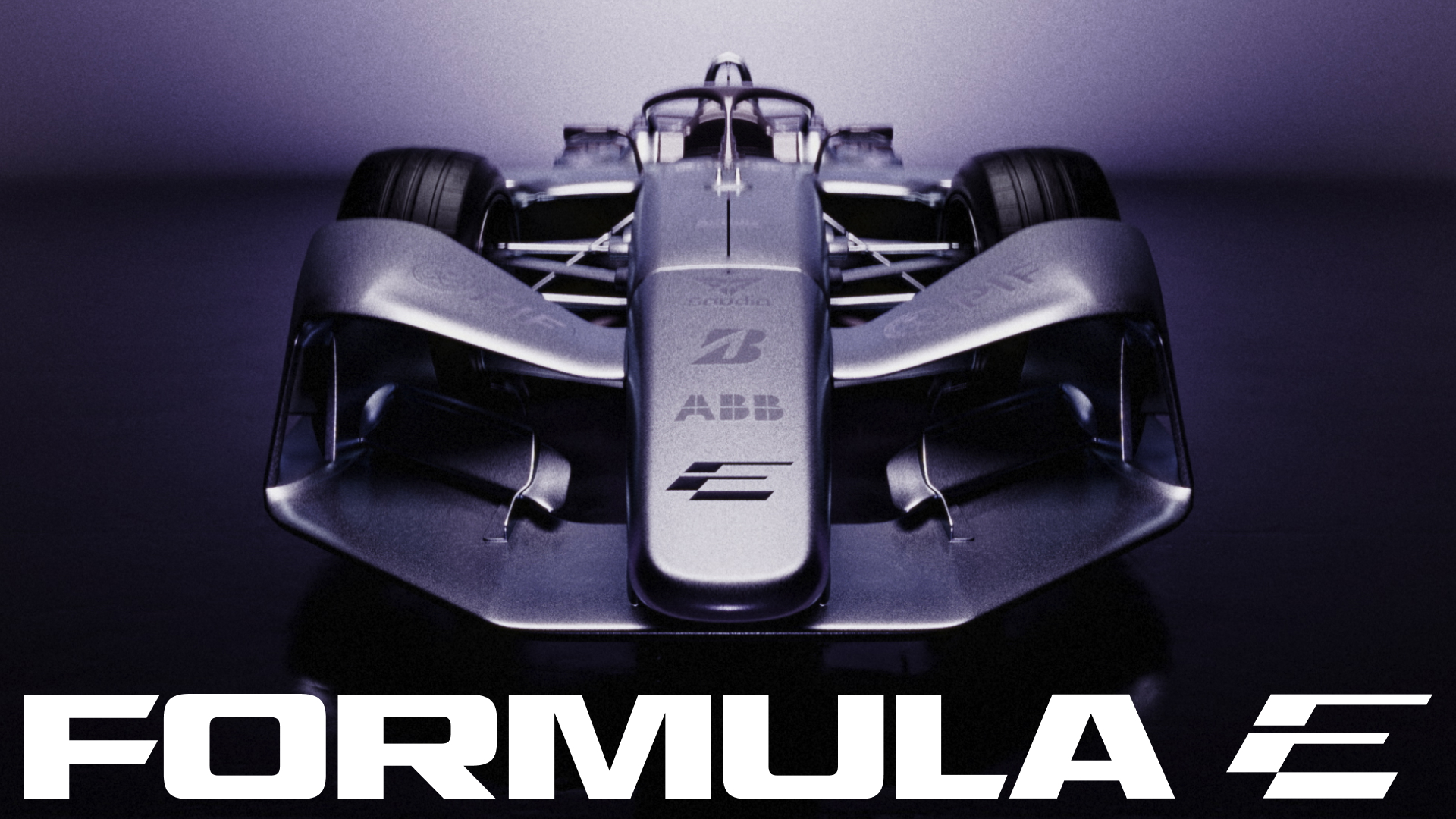 (Image credit: MOX/Formula E)
Formula E has unveiled a slick new identity, capturing the motorsport's dynamic evolution ahead of the GEN4 era of the ABB FIA Formula E World Championship. Shaped by a continuous drive for progression, the rebrand ushers in a fresh evolution that shines in its clarity and style.
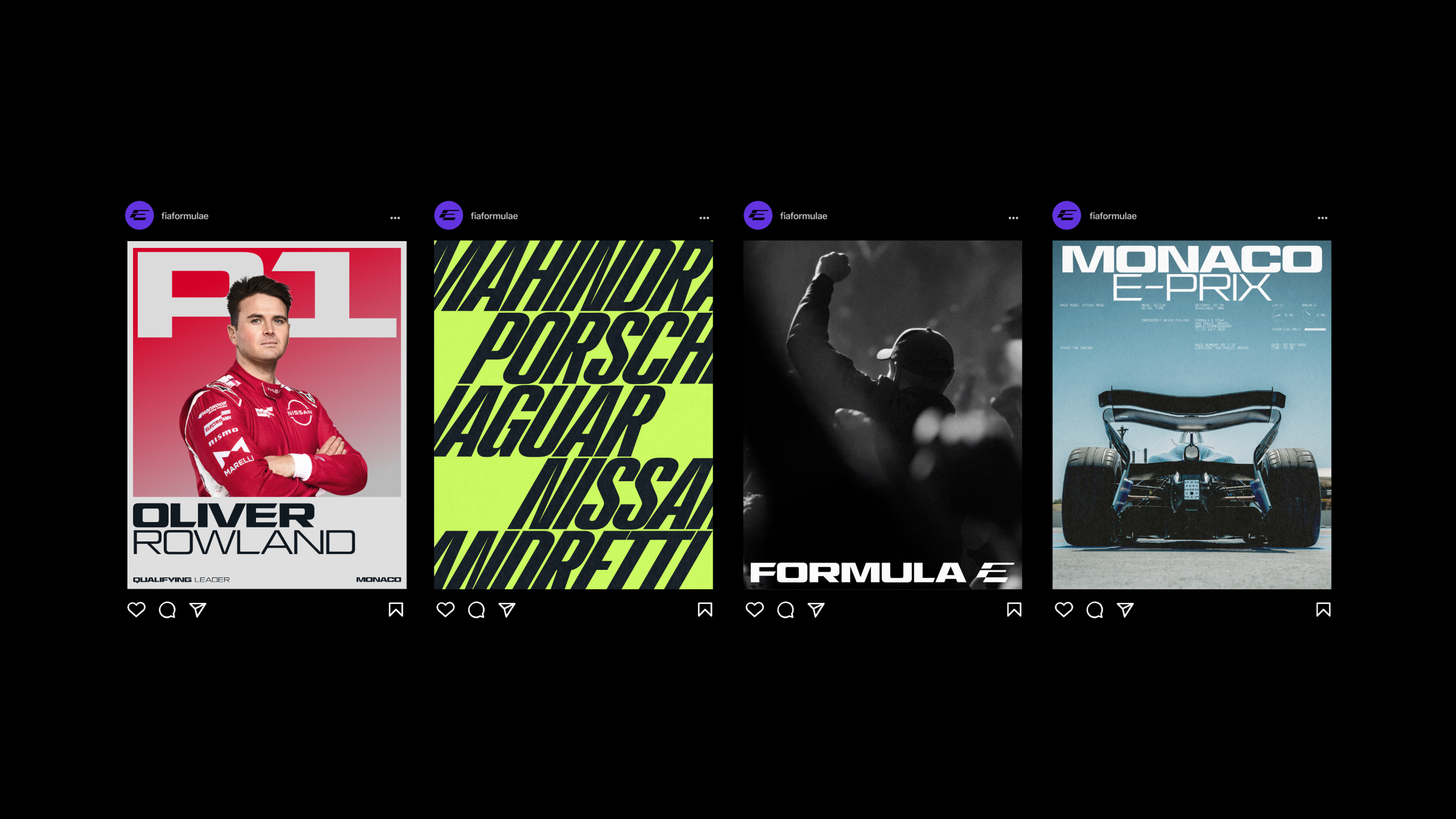
In keeping with the best rebrands, Formula E's new look is a distinct upgrade from its GEN3 era, refusing to stagnate in the comfort of familiarity. With a bold new wordmark logo, dynamic motion graphics and a slick new colour palette, the new Formula E identity embodies contemporary design with a sleek sporting edge.
Designed by global creative practice MOX, the new look centres on the slick logomark icon. Reflecting a championship that's "faster, more ambitious, and more culturally relevant" than ever, the visual double entendre of the stylised 'F' and 'E' creates an understated yet ingenious design that radiates motorsport's contemporary spirit. Resting at a 30-degree angle, it captures a momentum that carries throughout the wider identity.
"Anything that feels comfortable straight away dates quickly," says Matt Bolton, creative director and co-founder at MOX. "We went for a Marmite icon. It throws you at first, then it grows on you, and that’s what keeps it standing up in five seasons. You read the E immediately. The F is what you find afterwards.”
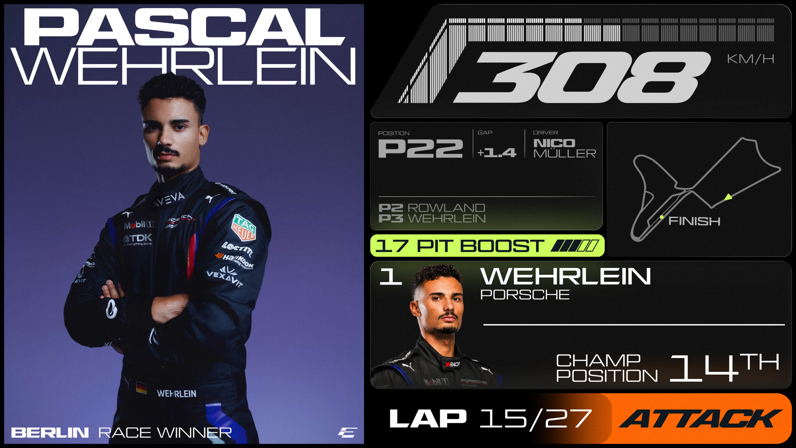
Created in collaboration with type foundry All Purpose Studio, the new bespoke typeface family is based on a customised cut of AP Gavel. Built for flexibility, condensed italic Turbo Mode generates momentum, while Micro Mono handles timestamps, reference codes and technical data alongside Inter for longer copy.
A new colour palette of Surge Purple, Signal Orange, and Electric Lime gives the brand a future-forward appeal, while Pulse and Ignite extend the system into gradients, grounded by Track Grey and a compact set of neutrals.
"Our previous identity was created for an earlier stage of our journey," explains Ellie Norman, chief marketing officer of Formula E. "This modern, expressive brand system matches the scale of our current ambition and gives us a powerful platform to lead the next generation of motorsport."
Sign up to the design newsletter from Creative Bloq, brings you the latest news and inspiration from the worlds of graphic design, branding, typography and more.
For more branding news, check out the new McLaren logo or take a look at Lexus' twisted new car design.
Natalie Fear is Creative Bloq's staff writer. With an eye for trending topics and a passion for internet culture, she brings you the latest in art and design news. Natalie also runs Creative Bloq’s 5 Questions series, spotlighting diverse talent across the creative industries. Outside of work, she loves all things literature and music (although she’s partial to a spot of TikTok brain rot).
| # | Наименование новости | Тональность | Информативность | Дата публикации |
|---|---|---|---|---|
| 1 | Lexus just dropped the most twisted car design I've ever seen – literally | 0 | 7.66 | 29-09-2026 |
| 2 | Chanel takes first dip into trophies with Boat Race designs | 0 | 8.16 | 30-09-2026 |
| 3 | Мантуров: один из китайских брендов рассматривает локализацию гибридов | 0 | 10 | 19-05-2026 |
| 4 | MOTORSPORTS | F2000 and F1600 classes headline the weekend’s MRF Challenge | 0 | 10 | 25-09-2026 |
| 5 | No, this isn't CGI! $150,000 robot has eerily human-like facial expressions and movements - as fans claim 'we'll be able to have a robot girlfriend that's way out of our league' | 0 | 14.55 | 03-08-2026 |
| 6 | Pick any colour watch – so long as it’s gold | 0 | 10 | 28-09-2026 |
| 7 | «АвтоВАЗ» подал заявку на регистрацию товарного знака «Можно, а зачем?» | 0 | 8.1 | 19-02-2026 |
| 8 | Авито Авто передал Музею транспорта Москвы уникальный гоночный болид | 1 | 8.31 | 23-09-2026 |
| 9 | Inside F1’s Five-Figure Moving Restaurant | 0 | 10.4 | 22-09-2026 |
| 10 | E-motor production technology | 0 | 18.09 | 23-07-2026 |